Previously,
I have gone through the various user interface (UI) for the game “Baby Rush”.
Today, I will further go into detail on each individual UI.
The first
UI I will talk about is the energy bar for the baby. As seen right here, the UI
is just a simple design with blue bar representing baby’s current energy level.
There is also an image icon on the left of the baby depicting a baby’s face.
Based on the design of this UI, audience will be able to learn and understand
it after playing the game for a while, but not immediate as the UI still lacks
information. Once they have learnt it, it will be easy for them to remember it
and use it efficiently. The UI also provides satisfaction to the audience in a
certain degree, largely due to the use of the image icon. Overall, I would say
that the UI is not error free, since it requires some time for the player to
understand it. Below contains more information on this UI:
The UI
itself is not that affordance, due to the lack of information to represent that
it’s the energy level of the baby.
The UI is
largely constraint to actions given to the baby during the game.
The UI is
visible to the audience as it appears directly on top of the screen.
The UI is
interdependent with actions performed by the player during the game.
The UI
tracks the baby’s current energy level. If a correct action is given to the
baby, the energy level will be reduced. As the goal of the game is to take care
of the baby till he is tired, the bar actually motivates the player to work
towards the goal.
The UI
itself is consistent along with the happiness bar due to similar design.
The second
UI which I will talk about is the happiness bar which can be found right beside
the energy bar. The UI design is quite similar to the energy bar. The bar
itself is yellow in colour and there’s an image icon on the right side of the
bar depicting a happy baby. Based on the design of this UI, audience will be
able to learn and understand it after playing the game for a while, but not
immediate as the UI still lacks information. At least, they will understand
that it has something to do with a happy baby. Once they have learnt it, it
will be easy for them to remember it and use it efficiently. The UI also
provides satisfaction to the audience in a certain degree, largely due to the
use of the image icon for a simple casual game like this. Overall, I would say
that the UI is not error free, since it requires some time for the player to
understand it. Below contains more information on this UI:
The UI
itself is more affordance as compared to the energy bar, due to the lack of
information to represent that it’s the happiness level of the baby (since it is
much clearer due to the use of icons and colour scheme).
The UI is
largely constraint to actions given to the baby during the game, as baby gains
happiness for each completed action.
The UI is
visible to the audience as it appears directly on top of the screen.
The UI is
interdependent with actions performed by the player during the game.
The UI
tracks the baby’s current happiness level. If a correct action is given to the
baby without him crying, the happiness level will increase. Higher happiness
means higher rate of energy loss.
The UI
itself is consistent along with the energy bar due to similar design.
The third
UI which I will talk about is the game timer. It is located at the top right
hand corner of the screen. As seen right here, the UI design is a cartoonish
digital alarm clock in order to fit the theme of the game and it is a good
representation of a timer. Based on the design of this UI, audience will be
able to learn and recognize the purpose of the UI instantly due to the design.
Because of that, the UI is easy for them to remember it and use it efficiently.
Depending on the audience preferences, the UI might or might not provide
satisfaction to the audience as the artwork of the UI can blend into the game
environment. Overall, I would say that the UI is not error free, largely due to
the art design. Below contains more information on this UI:
The UI
itself is largely affordance due to the design and placement of the UI.
The UI has
no constraint as it does not affect the gameplay whatsoever.
The UI is
visible to the audience as it appears directly on the top right hand corner of
the screen.
The UI is
independent to itself.
The UI
tracks the game time for the level.
The UI
itself is inconsistent when compared to the other UIs.
The fourth
UI present in the game is the baby’s patience bar which is located above the
baby. The UI design is just a simple bar that represents the baby’s current
patience level. The bar itself is red in colour. Based on the design of this
UI, audience will be able to learn and understand once the baby is crying,
since the bar will only begin increasing when the baby is crying. Once they
have learnt it, it will be easy for them to remember it and use it efficiently.
The UI also provides satisfaction to the audience as the UI design is simple
and does not occupy large amount of spaces. Overall, I would say that the UI is
largely error free. Below contains more information on this UI:
The UI
itself is affordance due to the design and placement of the UI, but only when
the baby starts to cry for the first time.
The UI has
no constraints when the baby is not crying. The UI is largely constraint to
player’s action when the baby is crying.
The UI is
visible to the audience as it appears directly on top of the baby.
The UI is
independent to itself when the baby is not crying. It becomes interdependent to
player’s action when the baby is crying.
The UI
tracks the current level of baby’s patience. When a task is completed while the
baby is crying, the bar resets.
The UI
itself is largely consistent together with the happiness bar and the energy
bar.

The fifth
UI present in the game is the baby event pop up. It is located around the top
part of the baby when an event is generated. The UI design is just the icon of
a specific event at the center of the speech bubble like pop up. Based on the
design of this UI, audience will be able to learn and understand when the baby
needs something, since after all; this is a casual strategy game. So when the
pop up appears, it sends a message to the audience that this is what the baby
wants. Once they have learnt it, it will be easy for them to remember it and
use it efficiently. The UI also provides a certain degree of satisfaction to
the audience as the UI design is simple and does not occupy large amount of
spaces. The only downside of the UI is the colour scheme, which might blend
into the game itself. Overall, I would say that the UI is not 100% error free
due to the current colour scheme. Below contains more information on this UI:
The UI
itself is affordance due to the design and placement of the UI, but only when
the baby wants something.
The UI is
largely constraint to player’s decision when the baby wants something.
The UI is
visible to the audience as it appears directly on top of the baby.
The UI is
interdependent to player’s decision when the baby is crying.
The UI
shows what the baby wants. It remains there until a specific task is completed.
The UI
itself is largely consistent together with the player status pop up.
The sixth
UI in the game is the player status pop up. It is located at the top portion of
the player, and will only shows up when the player is holding onto something. Based
on the design of this UI, audience will take quite some time to completely
understand the function of this UI as it looks similar to the UI of the baby
event pop up. Once they have learnt it, it will be easy for them to remember it
and use it efficiently. The UI might not be able to satisfy the audience as the
design is almost completely similar to the event pop up, and they might get
confused. Also, based on the UI colour scheme, it may blend into the game
environment itself. Overall, I would say that the UI is not error free and may
cause confusion to the audience. Below contains more information on this UI:
The UI
itself is affordance due to the design and placement of the UI, but only when
the player is holding onto something
The UI is
largely constraint to player’s actions.
The UI is
visible to the audience as it appears directly on top of the player.
The UI is
interdependent to player’s actions.
The UI
shows what the player is currently holding. It will only disappear when the
object is given to the baby.
The UI
itself is largely consistent together with the baby event pop up.
The seventh
UI element in the game is the visual feedback given off whenever the player
pushes the interact button. Based on the design of this UI, audience will be
able to understand whether they have hit the button without looking directly at
their keyboard. It is very easy to notice and does not consume too much space.
The UI is able to satisfy the audience based on their own personal preferences
as the effect might be distracting. Furthermore, the UI is small and does not
consume a lot of spaces, and has a nice colour scheme that will not affect the
gameplay visually. Overall, I would say that the UI is largely error free.
Below contains more information on this UI:
The UI
itself is affordance once the player pushes the interact button.
The UI is
largely constraint to player’s hitting onto a specific button.
The UI is
visible to the audience as it appears near the player.
The UI is
interdependent to player’s keyboard actions.
The UI
shows up when the player pushes the interact button.
The UI
itself is largely consistent along with the 2 pop ups.
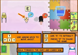
The final
UI element in the game is the tutorial pop ups that appear during the tutorial.
Based on the design of this UI, audience will be able to understand the purpose
of the UI once they look at it, as it provides essential information on the
game itself, which they must learn. Because it contains useful information on
the game, audiences are able to follow it efficiently and complete the
tutorial. The UI may or may not satisfy the audience as it takes out too much
space on the screen, but at the end of the say, these instructions are short
and simple. Overall, I would say that the UI is largely error free. Below
contains more information on this UI:
The UI
itself is affordance due to it contains relevant information on the game
itself.
The UI is
largely constraint to the progression of the tutorial.
The UI is
visible to the audience.
The UI is
interdependent to the tutorial progression. Different sets of instructions will
only pop up at a specific point of the tutorial.
The UI guides
the player through the tutorial. It will disappear/changes to a new one once a
specific action is completed by the player.
The UI
itself is inconsistent as compared to the other UIs.